Table
The Table widget is one of the most complex and powerful widgets in MINEO. It is a "batteries included" widget, as you only need to configure the input to start displaying the data, but you can customize every aspect to your needs, from data formatting to style or user interaction events.
Widget table is most useful for displaying large dataframes, as it automatically manages pagination reducing the browser memory and improving performance.
Basic usage
First, we need to create our dataset. We will use a pandas dataframe. Paste this code into a Python block and execute it:
import pandas as pd
df = pd.DataFrame([
  {'sector': 'A', 'value': 100},
  {'sector': 'B', 'value': 200},
  {'sector': 'C', 'value': 300},
])
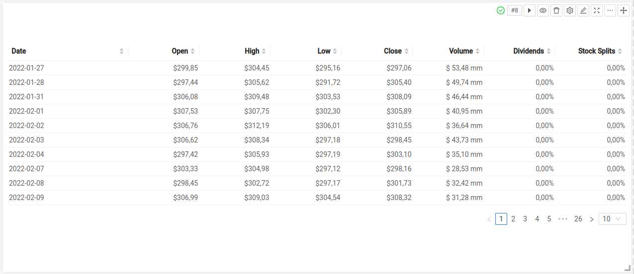
Now, create a Table widget and configure its Dataframe field to point to the variable $df.
Save, and a basic table should display with the dataframe data.
Advanced usage:
Data insertion
Widget table allows users dynamic row creation to add information to dataframe into a structured format. When a new row is created by the user, it is automatically inserted into a dataframe. To enable data insertion, in Basic table configuration using can select Allow add elements checkbox.
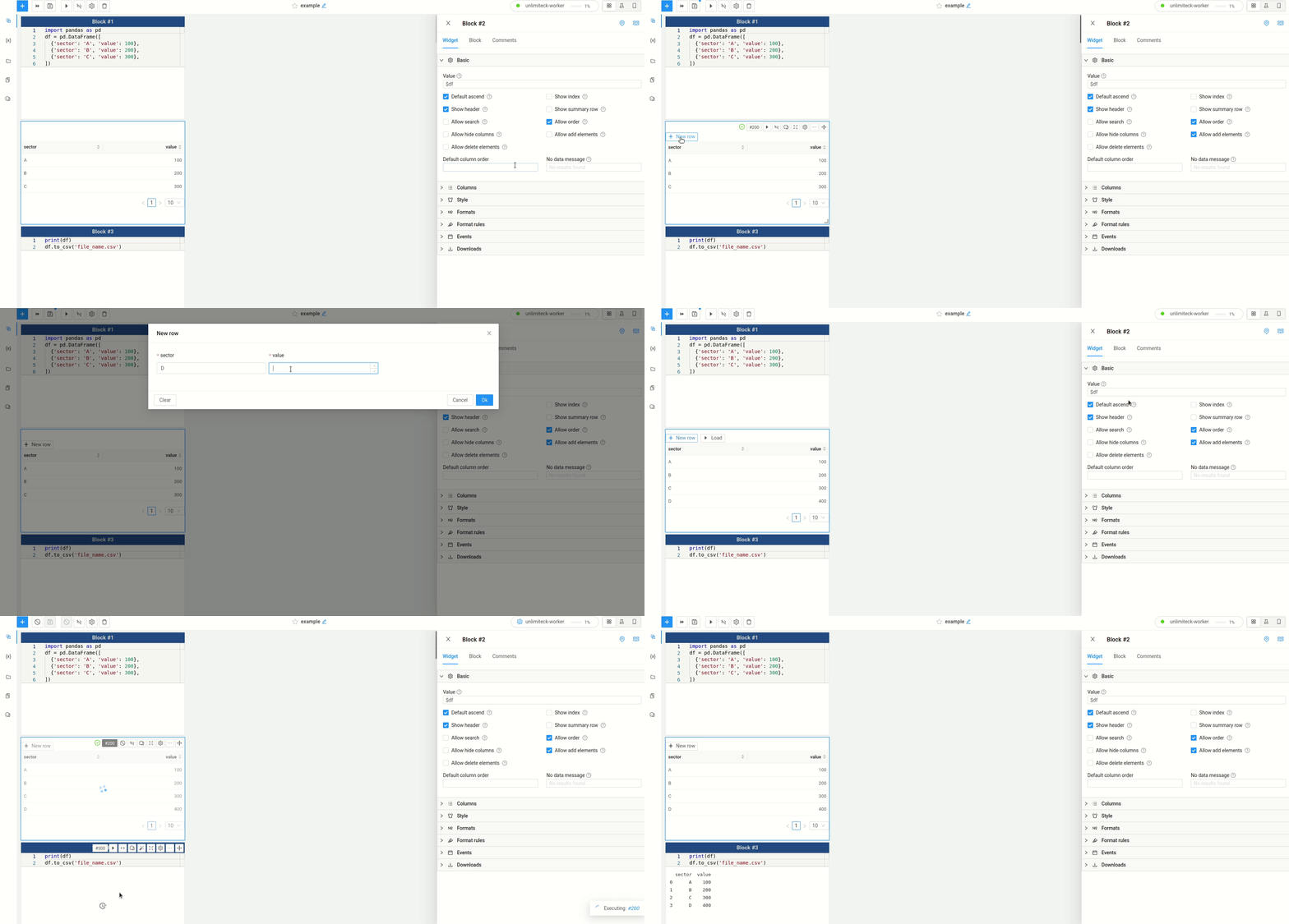
The given example demonstrates a simple and effective way to add elements to a Pandas dataframe and export it as a CSV file, making it accessible as a data source for other notebooks or widgets. This csv is accessible in MINEO file system.
Table row insertion is only available for Pandas dataframe as data source.
Data deletion
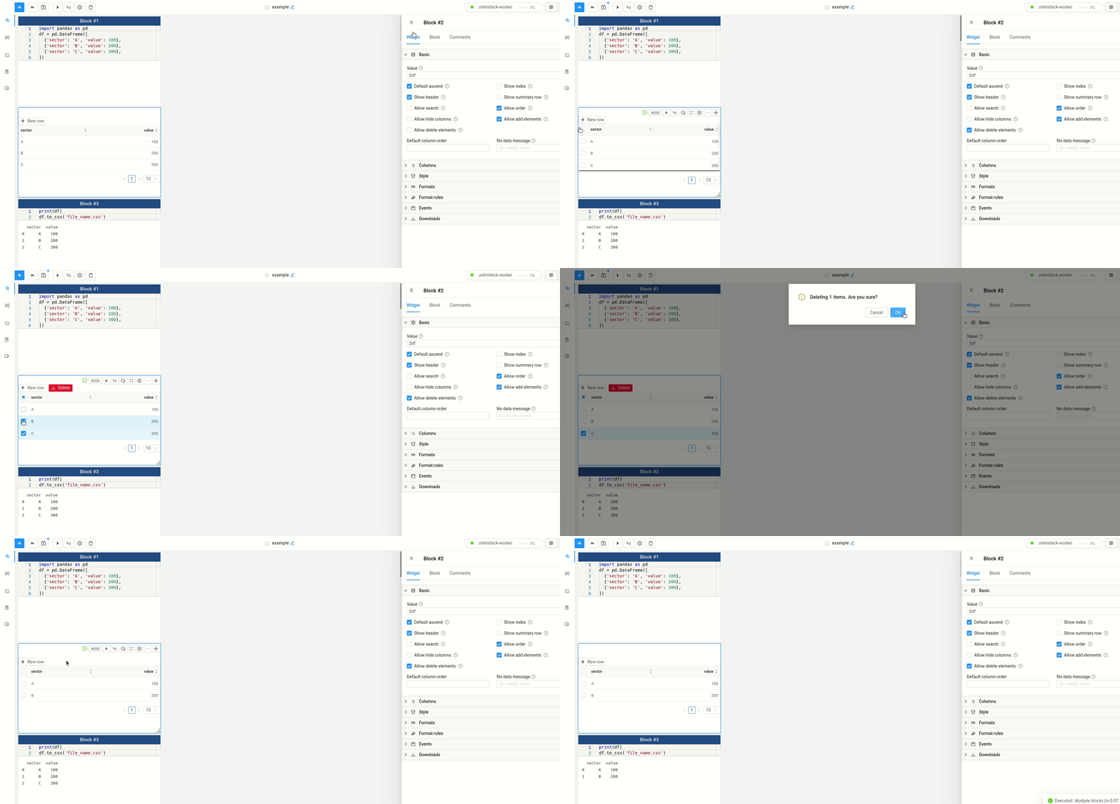
With this widget users can not only insert new elements into a pandas data dataframe, but also delete specific rows, providing a flexible way to manage your data. The widget table interface allows users to interactively view and modify the data stored in a pandas dataframe. In addition to inserting new rows, you can select and delete existing rows from the data source.
By simply selecting the row(s) you want to remove, the widget table enables you to delete the selected rows from the pandas dataframe with ease. This dynamic functionality allows for quick data clean-up and manipulation, providing a streamlined approach to data management.
Column cell edition
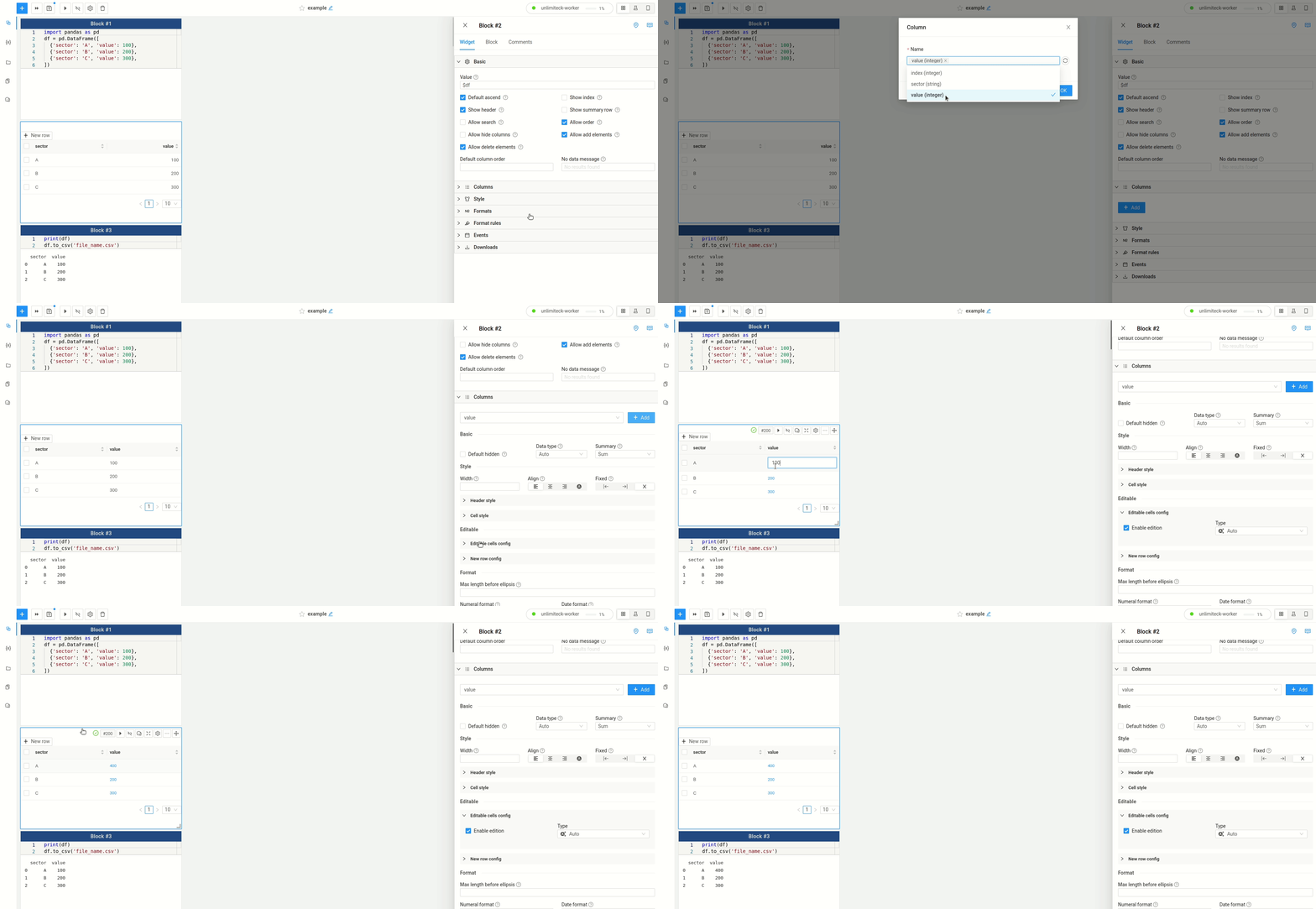
In addition to row insertion and deletion, the widget table provides the capability to edit individual cell values within columns of a pandas data source. With the widget table, users can interactively modify the data stored in a specific column by directly editing the cell values. This functionality allows for convenient updates or corrections to the existing data. By simply selecting a cell within the desired column, you can modify its value directly within the widget table interface. This dynamic editing feature provides a user-friendly way to make adjustments to specific data points, ensuring accuracy and flexibility in your data analysis.
Advanced Example:
Conditional column formatting in table widget
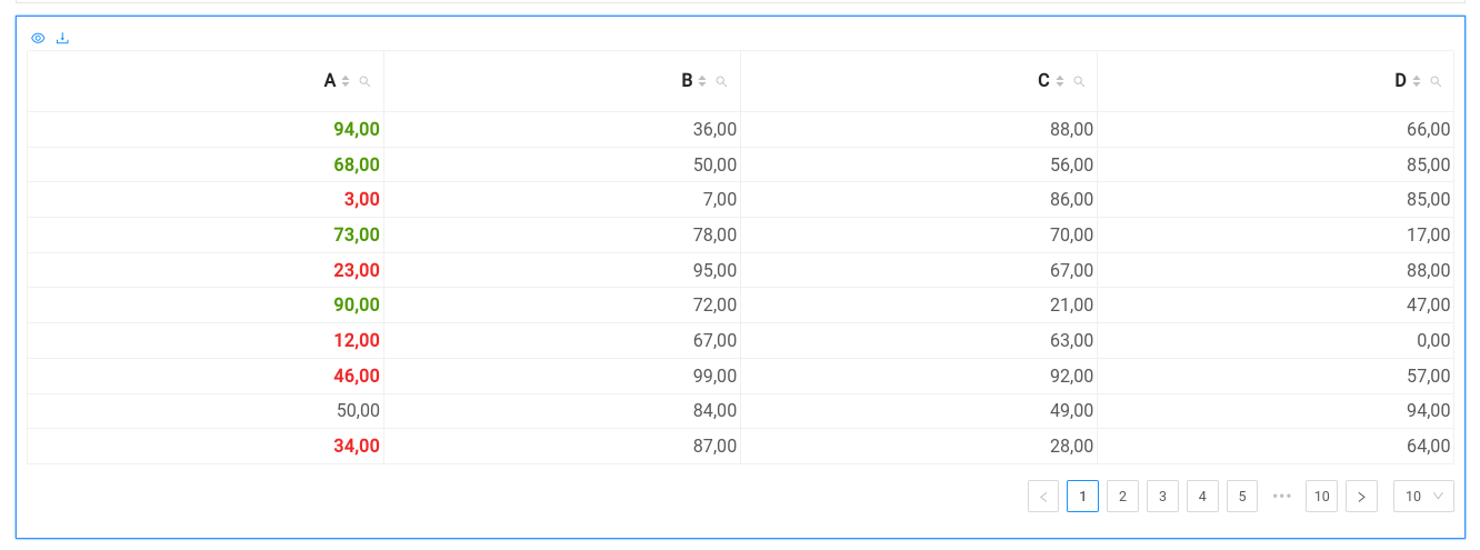
This example demonstrates how to use conditional formatting to highlight important information in a table widget. By defining a custom formatting rules, you can easily control the appearance of your data based on specific criteria.
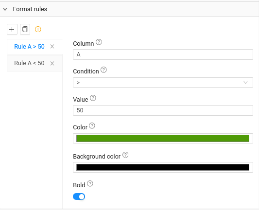
Start by defining your dataframe and widget as in the basic example. Then open the widget configuration and set some formating conditions and colors under the Format rules section.
- You can apply different conditions for the same column, each with a unique style
- In case of overlapping conditions on a column the last one takes precedence
After saving the table is updated and displays the highlighted values for the desired columns.
API reference
With its flexible settings, you can easily customize your table widget to meet your specific needs.
Choose whether to allow searching, ordering, or hiding columns, set the default order and display options, or define the minimum column width.
Basic
| Setting name | Type | Description | Default |
|---|---|---|---|
Dataframe | string/dataframe_variable_name | string/query_variable_name | string/form_variable_name | The input dataset to display. Must be a Python variable of one of the stated types. | |
Allow search | boolean | Whether to allow the user to filter columns | false |
Allow order | boolean | Whether to allow the user to order columns | true |
Allow hide columns | boolean | Whether to allow the user to hide columns | false |
Allow add elements | boolean | Whether to allow the user to add elements to table | false |
Default ascend | boolean | Whether to order columns by default in ascending order | false |
Show index | boolean | Whether to show the index column | false |
Show header | boolean | Whether to show the header row | true |
Show summary row | boolean | Whether to show a row with summary statistics | false |
Default column order | string | The default column order. Comma-separated list of column names. | |
No data message | string | The message to display when the dataset is empty |
Style
The Style settings allow you to adjust the appearance of your table, including its size, alignment, and whether to fit the table to the block size or scroll horizontally.
| Setting name | Type | Description | Default |
|---|---|---|---|
Bordered | boolean | Whether to show a border around the table | false |
Condensed | boolean | Whether to show a table with condensed margins | false |
Size | smaller | small | default | big | The size of the table. | Small |
Alignment | start | center | end | Block alignment of the table. | center |
Fit table size | boolean | Whether the size of the table will be calculated based on the columns (true) or the data (false). | true |
Minimum column width | string | The minimum width of a column. | 100 |
Scroll X | number | Width for the horizontal scroll. Leave empty for no scroll (full width table). | |
Page rows | number | Number of rows to display at once. | 10 |
Page rows options | string | Comma-separated list of options for the number of rows to display at once. | 10,25,50 |
If you clear both the Page rows and Page rows options fields, the table will not show pagination controls.
Events
The Events settings let you trigger actions in response to clicks or table changes. You can also add an onClick variable to add to your notebook context the information of the event.
For instance you can put a variable named $my_table_event. And the retrieve the events on python like this:
my_table_events['events']
>>>
[{'col': 'Edad',
  'event': 'cell_edit',
  'row': {'Ciudad': 'Madrid', 'Edad': 25, 'Nombre': 'Edited Value!', 'index': 0}}]
| Setting name | Type | Description | Default |
|---|---|---|---|
On event | none | onClick | onEdit | Event that executes the current and subsequent blocks automatically. | none |
Run button label | string | Name of the button to execute the subsequent blocks when there is no event activated | |
Event variable | string | Name of the variable to store the data when the event is triggered |
Type of events
The information retrieved in the event will be a dict with the key event indicating the different kind of the event
Possible events are:
- cell_click. Will cointain the
rowandcolclicked - cell_edit. Will cointain the
rowandcolclicked - new_row. Will contain the data of the new row inserted
- delete_rows. Will contain the indexes deleted from the dataframe
The Downloads settings, you can easily download your data as a CSV or Excel file, with options to control the separator and include the index column.
| Setting name | Type | Description | Default |
|---|---|---|---|
Download | boolean | Whether to show a download button | false |
Alternative Download | dataframe_variable_name | If the download should be over another dataframe. | |
File name | string | The name of the file to download | |
CSV Separator | string | The separator to use in the CSV file. Should be a single character. | , |
Include index | boolean | Whether to include the index column in the downloaded file | true |
Excel | boolean | Whether to download as Excel instead of csv | false |
Formats
| Setting name | Type | Description | Default |
|---|---|---|---|
Numeral format for integers | string | The format to use for integers. See Numeral.js for more information. | |
Numeral format for floats | string | The format to use for floats. See Numeral.js for more information. | |
Percent | boolean | Whether to display the number as a percentage. | false |
Date format | string | The format to use for dates. See Moment.js for more information. |
Columns
Each item of the columns settings will affect one column of the table.
Basic
| Setting name | Type | Description | Default |
|---|---|---|---|
Column | string | The name or index of the column to configure. | idx:<column_index> |
Data type | auto | image | int | float | date | str | bool | naturalSort | The data type of the column. | Auto |
Default hidden | boolean | Whether to hide the column by default. | false |
Summary | None | Count | Count distinct | Sum | Average | Median | Std Dev | Min | Max | Display summary of the column. Can be the total, average, etc. Summary row must be enabled in the Basic section. | Sum |
Editable
Settings used to make cells editable
| Setting name | Type | Description | Default |
|---|---|---|---|
Editable | boolean | Whether to make the column editable. | false |
Selector values | string | Comma-separated list of values to display in the dropdown of editable cells. |
Style
General column style
| Setting name | Type | Description | Default |
|---|---|---|---|
Width | string/css_width | The width of the column. | |
Align | auto | left | right | center | The alignment of the column. Can be left, center or right. In Auto mode, values will be aligned depending on their type. | Auto |
Fixed | left | right | no | Whether to fix the column to the left or right of the table. | No |
HTML | boolean | Whether to render the content as HTML. | false |
Header style
Style of the header of the column.
| Setting name | Type | Description | Default |
|---|---|---|---|
Bold | boolean | Whether to make the header bold. | false |
Italics | boolean | Whether to make the header italic. | false |
Color | string/color | The color of the header. | |
Background color | string/color | The background color of the header. |
Cell style
Style of the cells of the column (except header).
| Setting name | Type | Description | Default |
|---|---|---|---|
Bold | boolean | Whether to make the cells bold. | false |
Italics | boolean | Whether to make the cells italic. | false |
Color | string/color | The color of the cells. | |
Background color | string/color | The background color of the cells. |
Format
Formats settings let you specify the numeral format for integers. With all these options, the Basic API provides a comprehensive solution for displaying and manipulating your data.
| Setting name | Type | Description | Default |
|---|---|---|---|
Max length before ellipsis | number | Max column cell text length before ellipsis applied | |
Numeral format | string | The format to use for the column. See Numeral.js for more information. | |
Percent | boolean | Whether to display the number as a percentage. | false |
Date format | string | The format to use for dates. See Moment.js for more information. |
Format rules
Format rules define a conditional style for each column depending on the value of a condition, evaluated for each cell. For example, you can mark in a green color every cell that has a value greater than 100.
| Setting name | Type | Description | Default |
|---|---|---|---|
Column | string | The name or index of the column to configure. | idx:<column_index> |
Condition | < | <= | = | >= | > =(str) | !=(str) | [a;b] | (a;b) | The condition to evaluate. | = |
Value | string | The value to compare to. | 0 |
Color | string/color | The color of the cells that meet the criteria. | |
Background color | string/color | The background color of the cells that meet the criteria. | |
Bold | boolean | Whether to make bold the cells that meet the criteria. | false |
See also
- All widgets — browse the full widget catalog.
- Query — produce the data this table displays.
- Chart — visualize the same data graphically.